Google Forms is very useful for conducting surveys. It’s reliable, works beautifully, and now has added formatting options. And, importantly, it’s free which makes it perfect for students conducting surveys – more appealing than its paid rivals with attractive but nonessential extras.
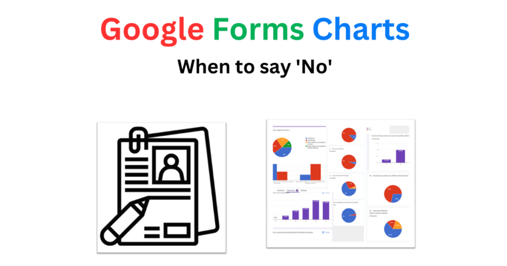
But there’s a problem here. As the responses come in, Google Forms provides a colourful chart for virtually every question asked. These charts are easy to copy and paste, so much so that it is fairly common to see dissertations littered with dozens of pie charts and bar charts in the results section, with the student painstakingly describing each one, but without summary or synthesis.
A single, elegant table would be preferable to Google Forms’ charts for each of the demographic items, and a few carefully organised charts that allow meaningful interpretation should be used rather than all the single-item pie and bar charts. In reviewing one student’s master’s dissertation, I recommended that their approximately 100 charts and tables be reduced to fewer than 10.
So, thank you to Google Forms for everything else, but no thanks for all the item charts.
Contact me at [email protected] if you need help with your thesis or dissertation.
Good morning Dr Merle
Hope you’re well. I’m still a honours student at NWU for educational language. I always read your messages and are helpful to me.
Thank you
Regards Gilroy Modutloa